Mobile Apps, Part I
In this tutorial, we will create a mobile app with Thunkable and connect your IoT applications with them! Thunkable is an easy to use “code-lite” mobile app creator, in which you can make mobile apps with only block-based code with no need to write text-based code. You can then upload this to your phone or even publish them on actual app stores if you wish to distribute your app.
Note: It is strongly recommended that this tutorial be done at home
Table of Contents
Signing up to Thunkable
We can sign up for Thunkable with our SST Google Account by clicking “Sign up with Google”. It’s that simple!
Once you have completed signup, you can click the links below on your mobile phone to download Thunkable Live so that you can upload the app to your mobile phone:

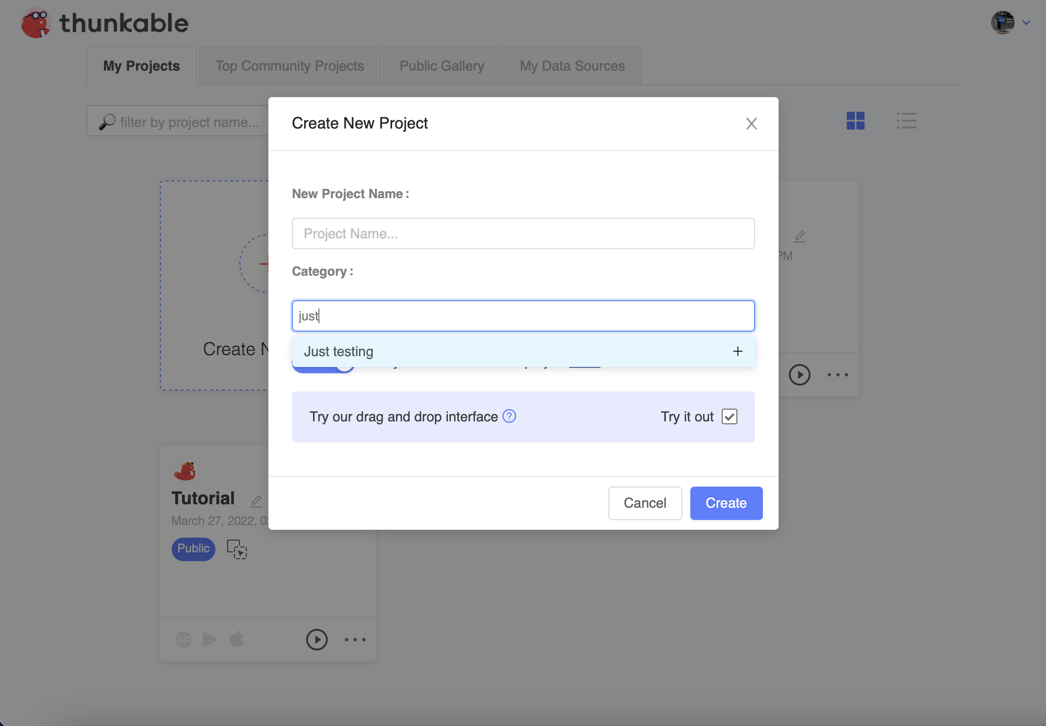
After signing up, you can start creating your first project. For the category, you can put “Just testing”.
It is highly recommended that you watch some of Thunkable’s tutorials at the link below, before you start this lesson to have a good idea of how to use Thunkable:
Thunkable Drag and Drop Tutorials
Hello World!
Time to start creating our first Thunkable app! This part of the tutorial will assume that you already understand how to operate the user interface of Thunkable and are familiar with some of the key concepts in Thunkable.
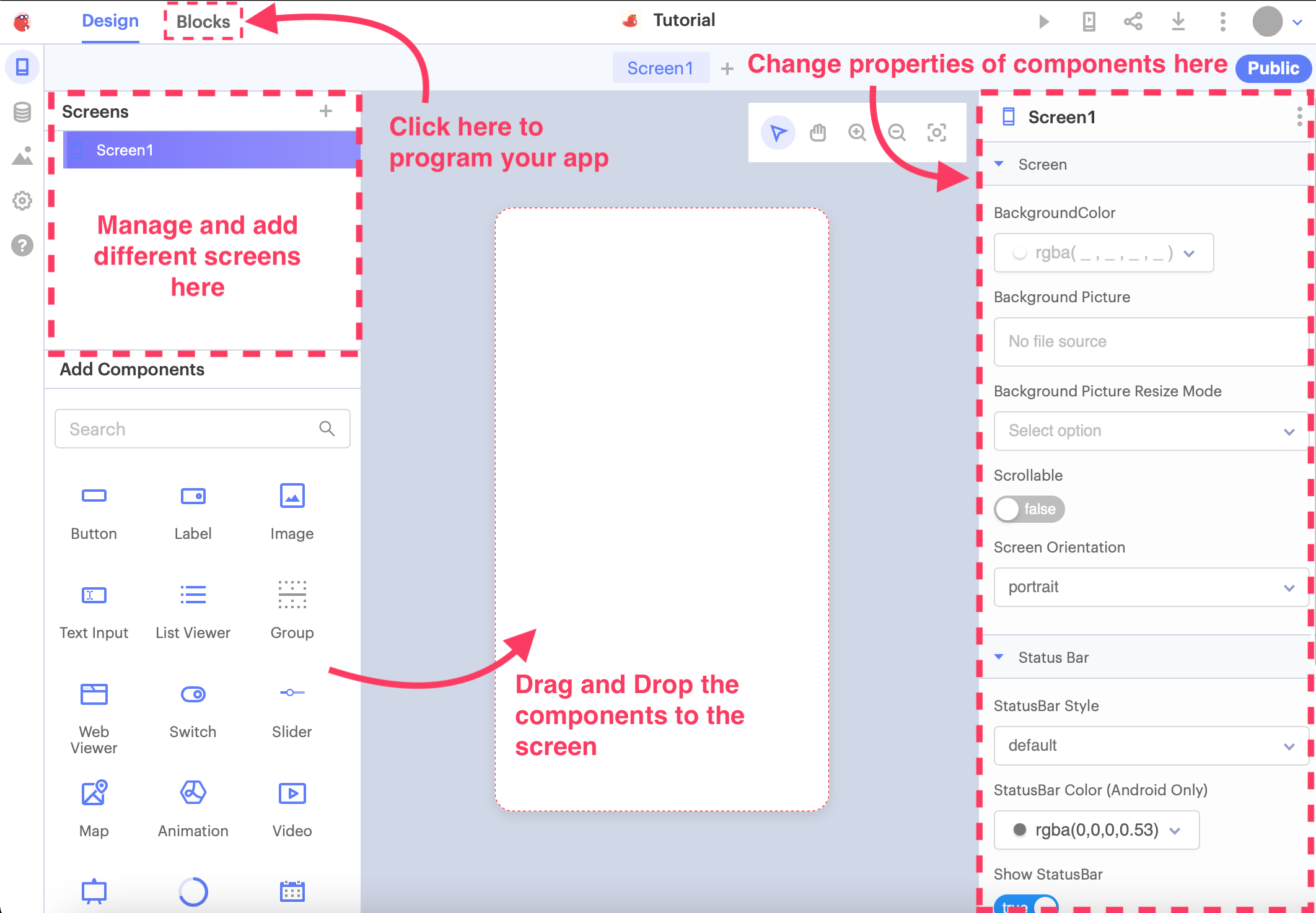
Now that you are on your app screen, let’s get familiar with the interface of Thunkable. On the left, you have the Screens and the Add Components menus.
The Screens menu is for you to add new screens and views to your app. The Add Components menu allows you to easily drag and drop components to your screen.
On the right side, you can change the properties of the individual components on your screen. For instance, you can change the words or colour of a label, or disable a button, and so on.
On the top bar, you can see two tabs: Design and Blocks. Design is the tab you are currently in, and lets you design your app screens. Blocks allow you to create the program behind each screen in your app, using block coding just like what you did previously in TinkerCAD.
Drag and Drop
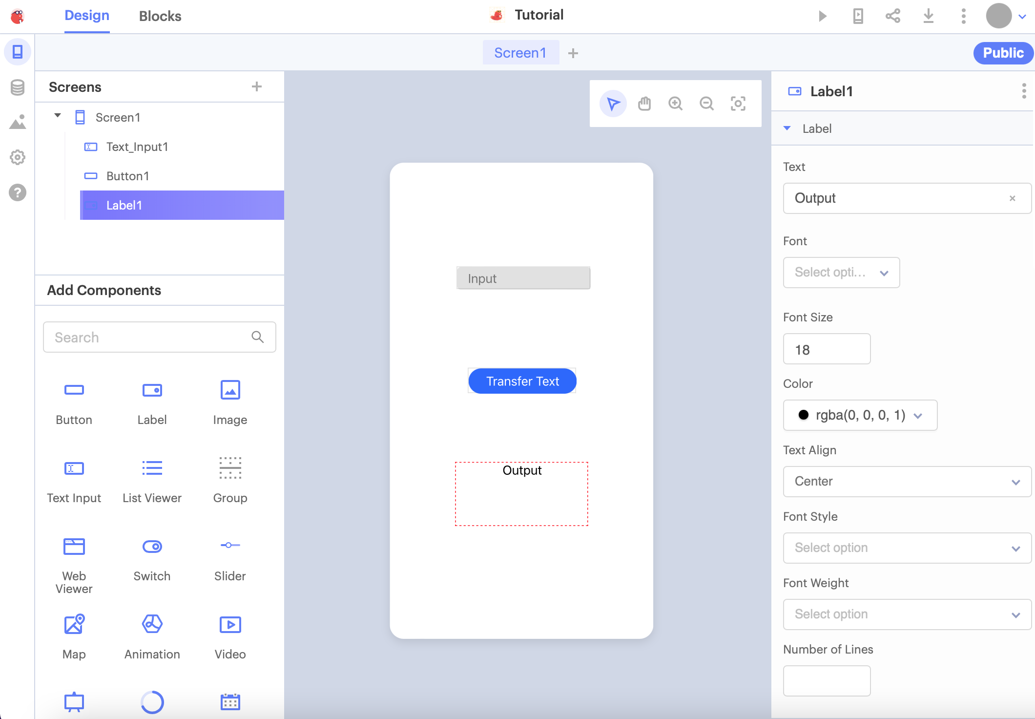
Let us try dragging and dropping some components into your app! The very first basic, but important component is the Label, which simply displays text on your screen. Drag it directly to the middle of your app.
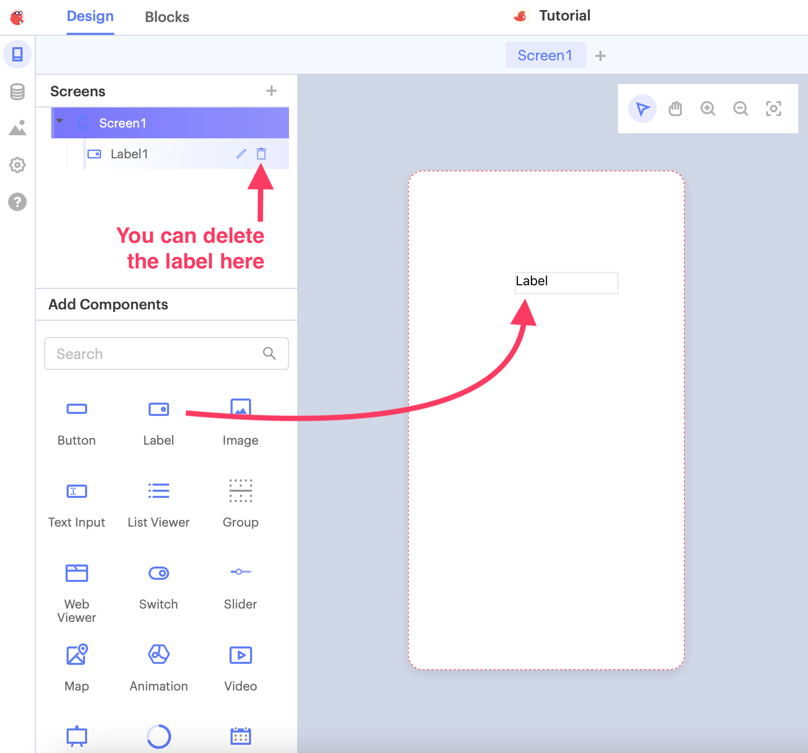
If you want to delete your label, simply press the trash can button on the Screens menu to delete the label. This is the same for other components in your app as well.
Adjusting the properties of the label
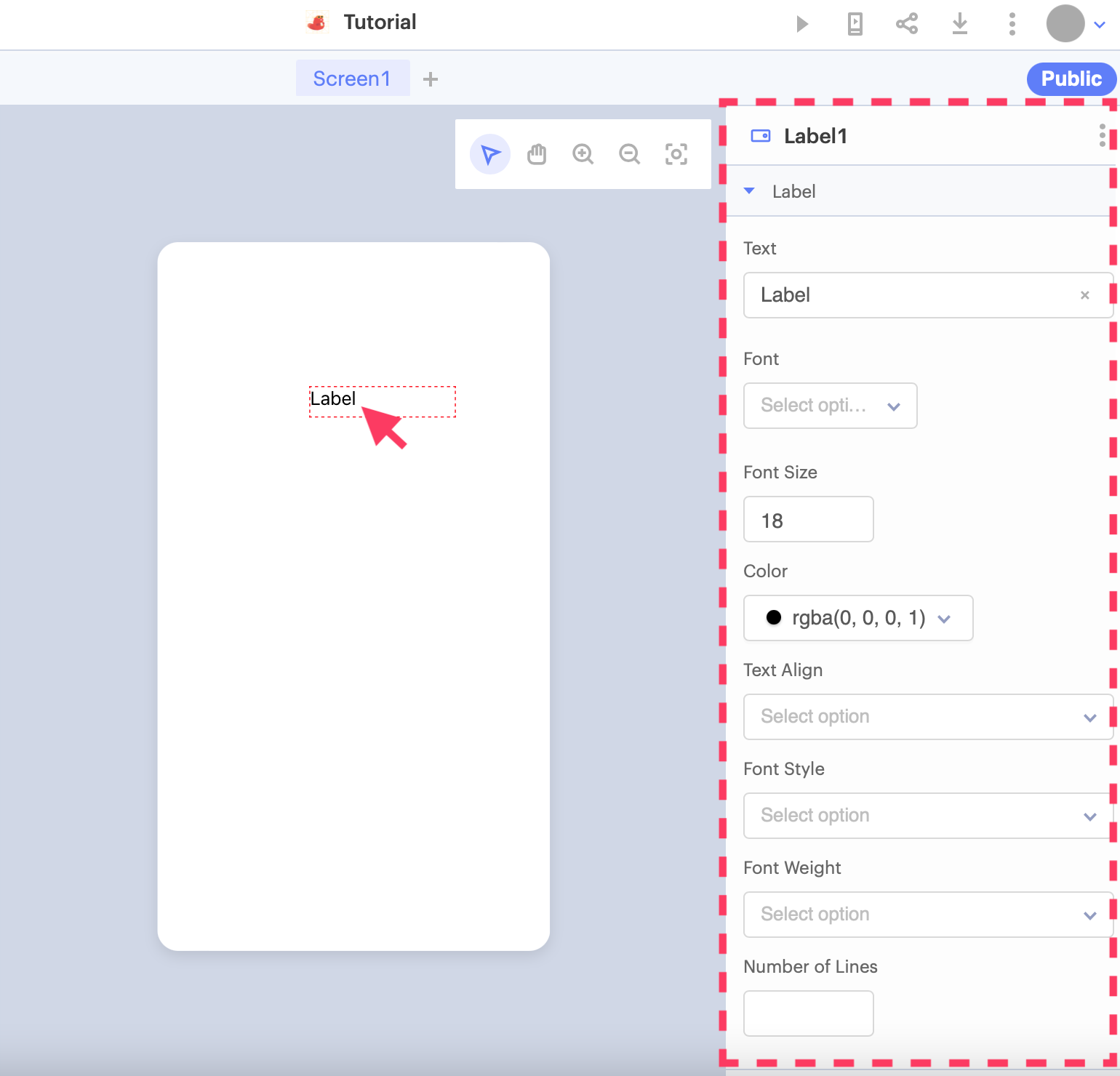
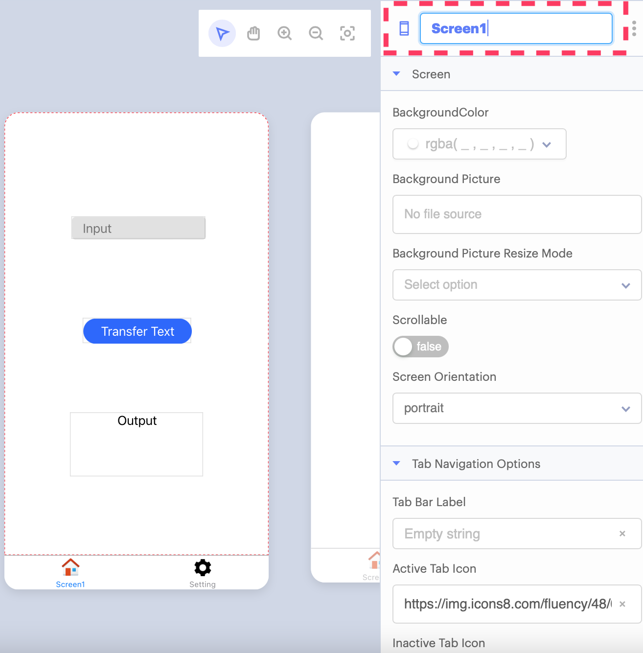
Click on the Label and you can now adjust the properties for that Label on the right side of the screen. You can change the contents, font, how big the words are, and so on. Try changing the label to say “Hello World”!
Advanced inputs
Let’s try dragging in a Button and Text Input this time. You can play around with the position and text on the Button and Text Input for now. When you’re done, change the text on the different components and drag them into the order shown below:
Activating Buttons
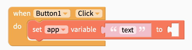
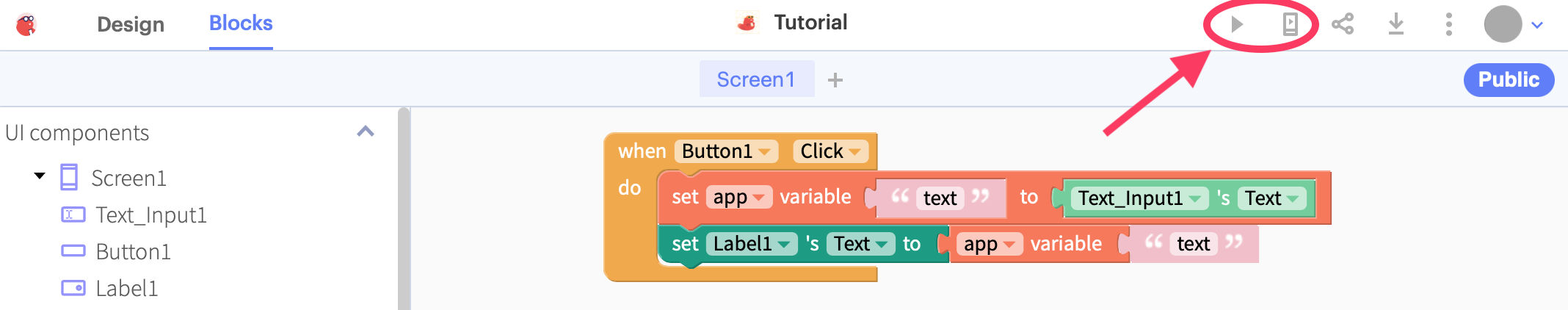
We are going to make a super simple app: replacing the text of the Label with the text inside your Text Input, the moment that the Button is pressed. Click on the Blocks tab on the top bar to switch to blocks editing.
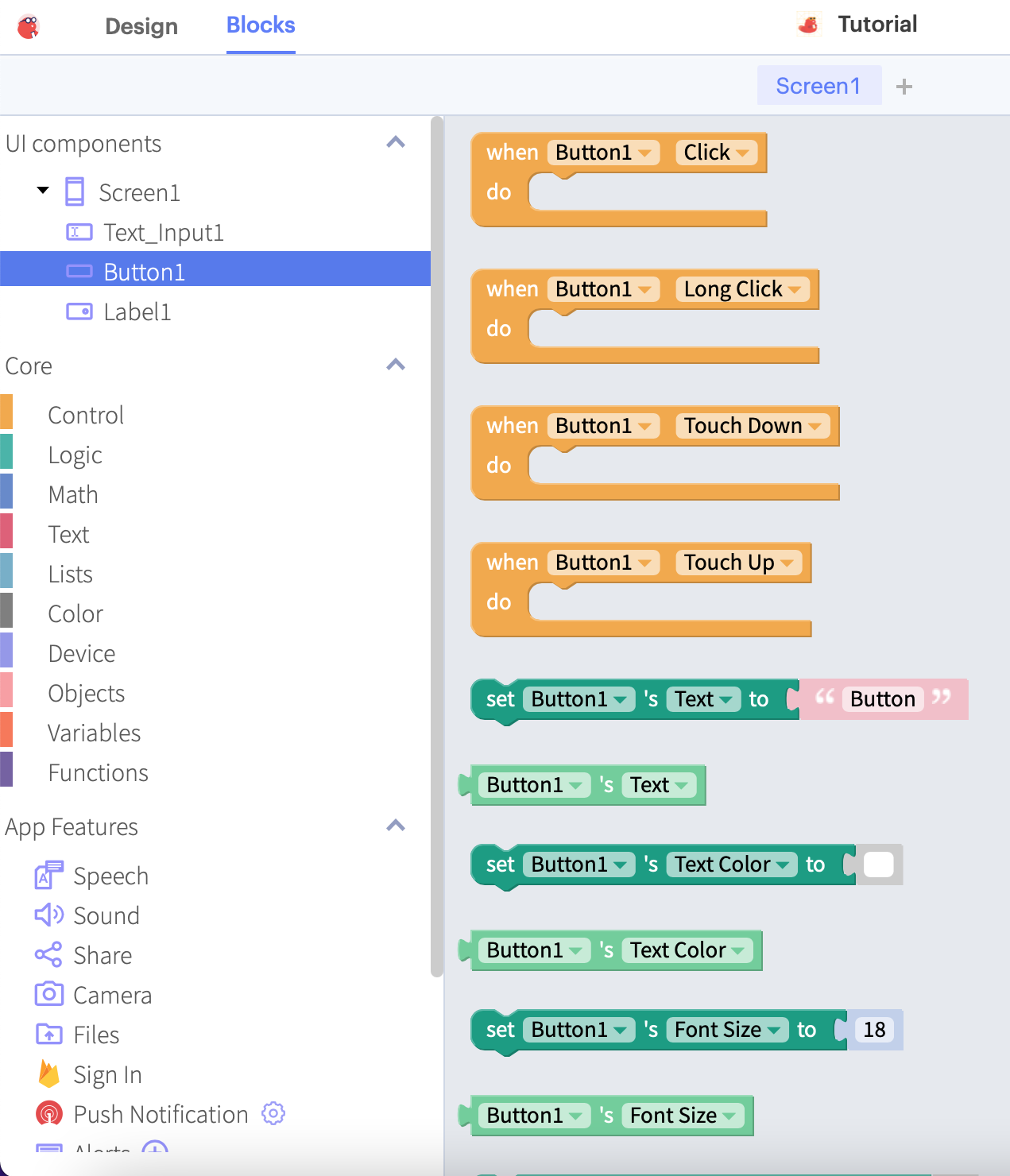
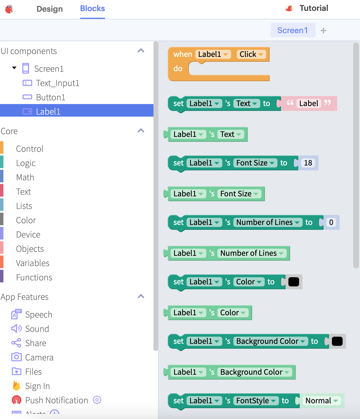
We can click on each of the components on the left bar to see the different functions we can use to change the components (e.g. changing the text on a Label, or reading the text from a Text Input):

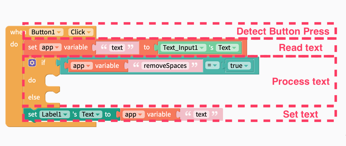
For our simple app, we would need to do 3 things:
- Detect when the button is clicked
- Read the text from the Text Input
- Set the contents of the Label to the same contents of the Text Input
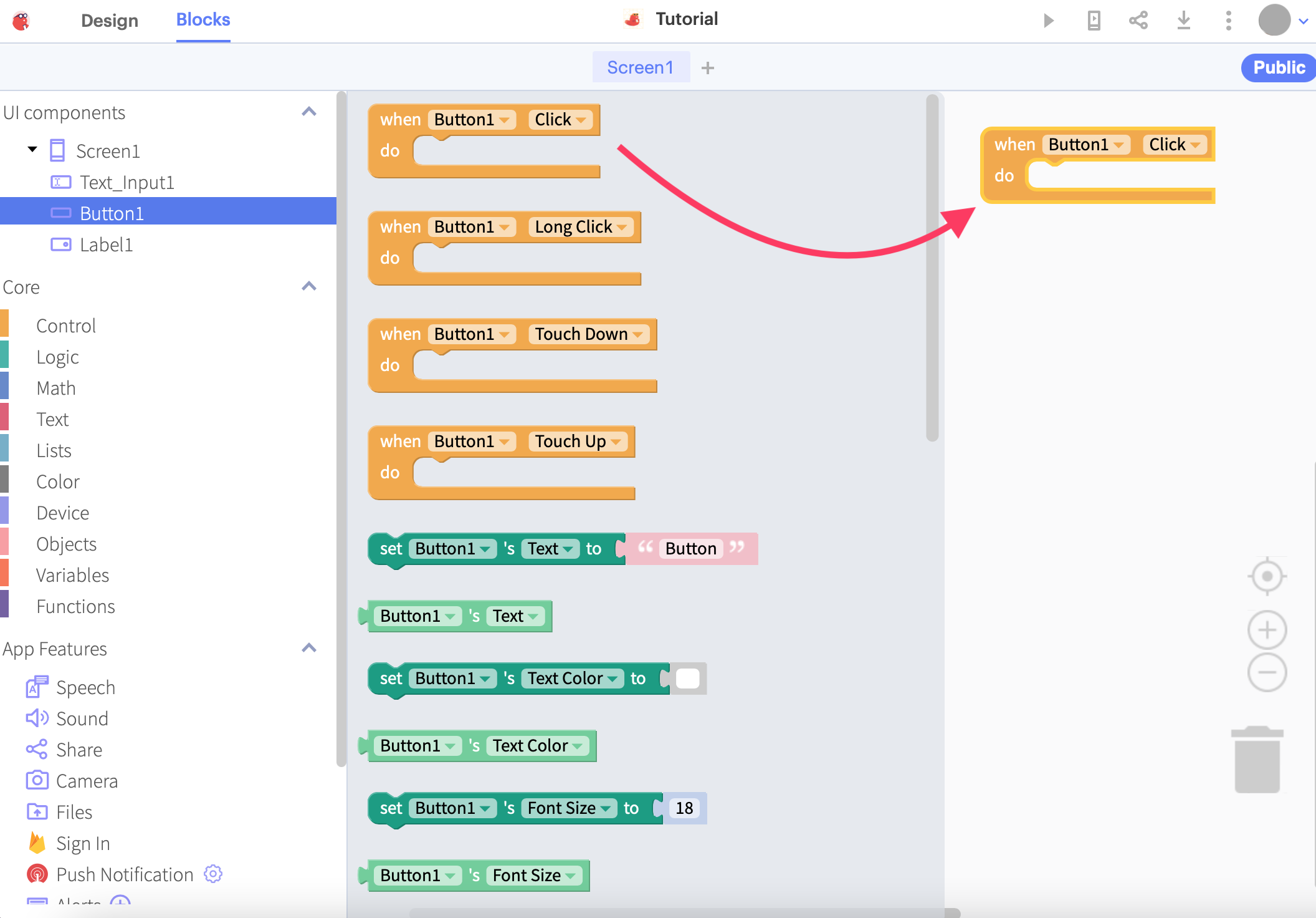
Starting with the first point, we can click the component for our Button and drag the when Button1 Click block into our blocks editor. Everything that goes into this block will be acted upon when you click that button.
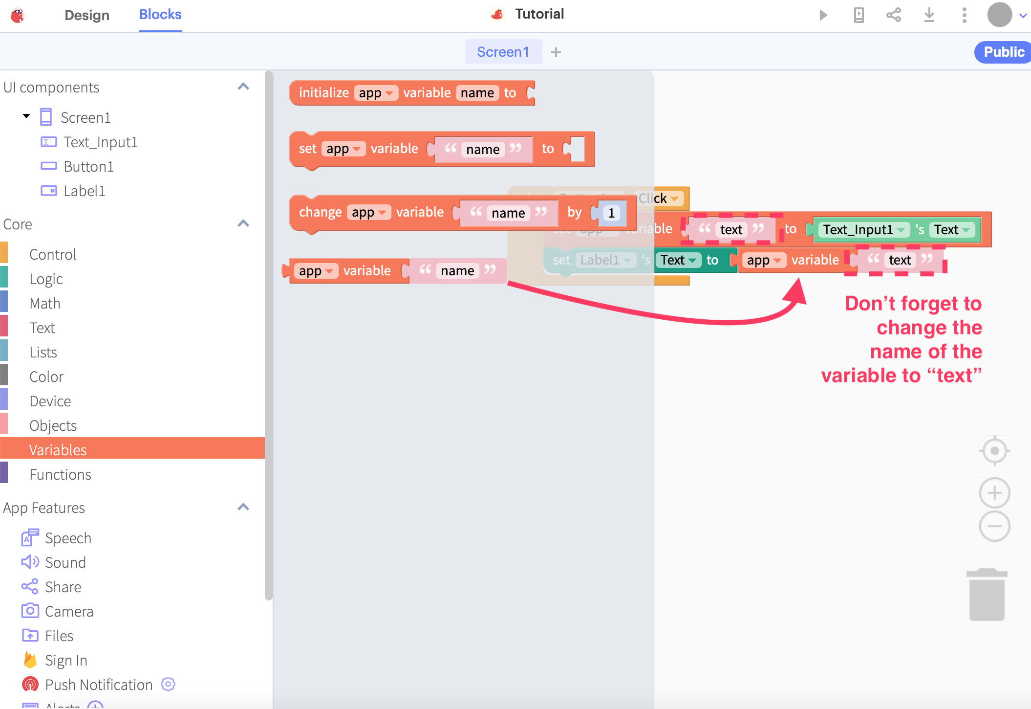
To complete point 2, we can use a variable to temporarily store the text that was read from the Text Input. Start by clicking the Variables option and dragging the set ‘app’ variable ‘name’ to __ block into the editor.
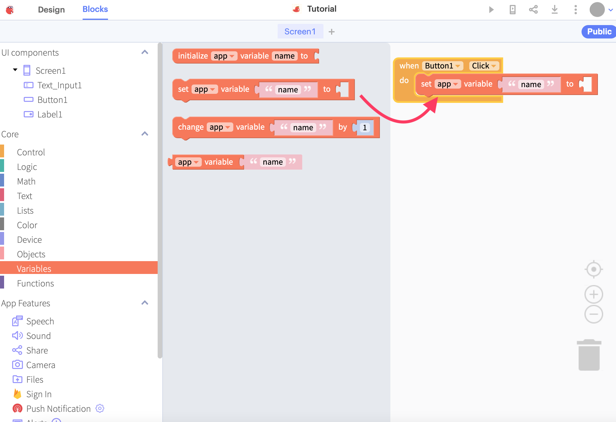
Let’s give this variable a name like “text”. Keep this name in mind because we will be using it later.
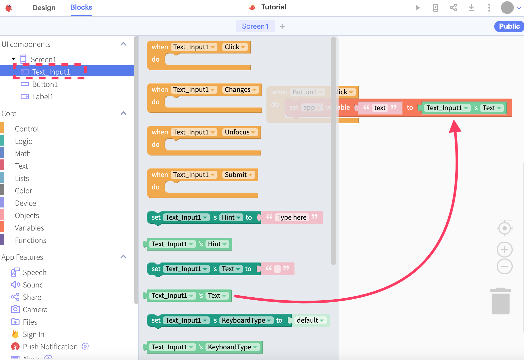
The last part of point 2 will be to actually read the text from the Text Input and store it into this variable.
We can do that by clicking the Text Input component and dragging the “Text” property of the component into the rear part of the statement.
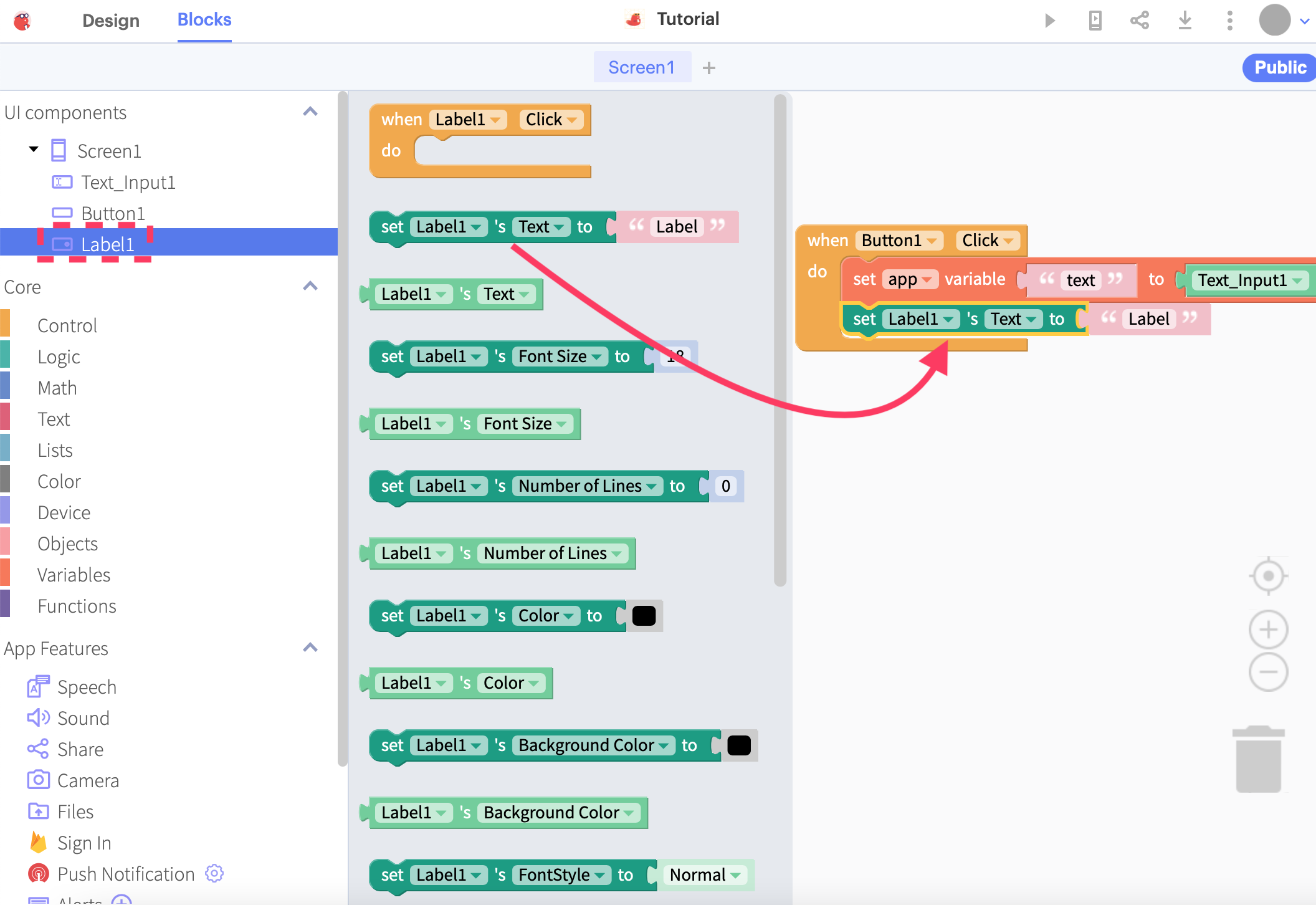
Finally, onto point 3: to set the contents of the Label to the “text” variable that we have just set. Click on your Label component on the left and drag the set Label1’s text to ___ block into the block editor, and drag the “app variable” block to the end of the “set” block, so that the code will set the text of your Label to the value of the “text” variable.
Fantastic! You have now completed your basic app that handles text input, a user action through a button, and the display of output. Next up, we are going to extend our app by processing the input text using some of Thunkable’s built-in functions and adding a tab bar at the bottom.
Navigating with a tab bar
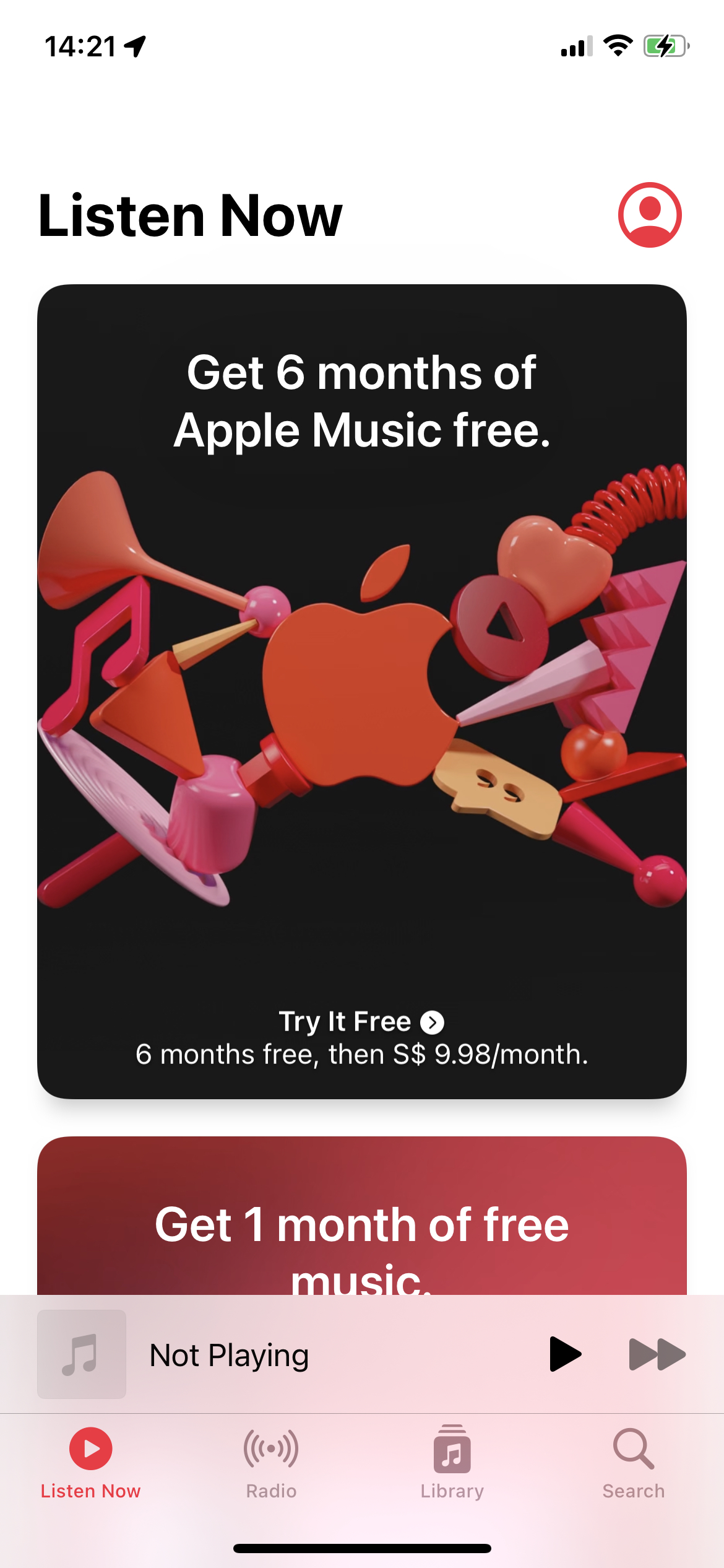
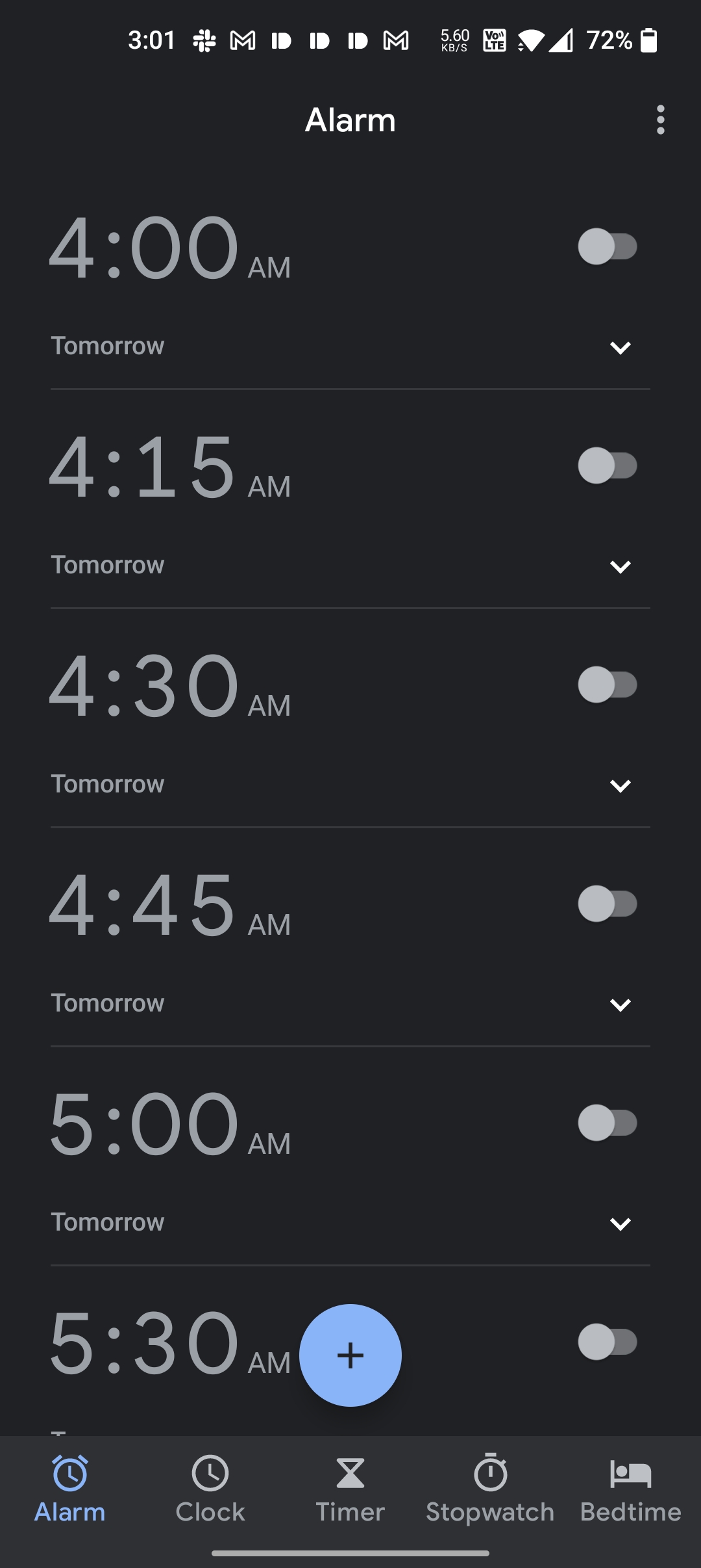
Many of you may have seen apps with a tab bar at the bottom, like Apple’s Music app, or the Android Clock app. Now we are going to make an app with a tab bar just like that.
We will now extend our app by giving it a Settings page so that we can choose which type of text processing we want our app to do.
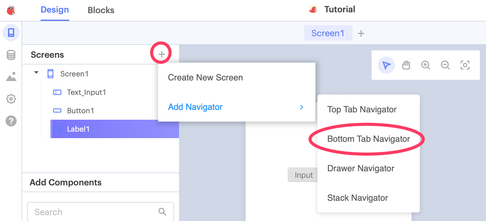
Click the + button on the Screens menu and click “Bottom Tab Navigator” to add the tab navigator to our app.
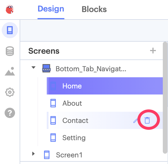
Wow, that’s a lot of buttons! Let’s delete the ones unnecessary for now. Since we are adding a Settings page, only Settings is relevant to us, so we can delete all of the rest by clicking the trashcan icon as above.
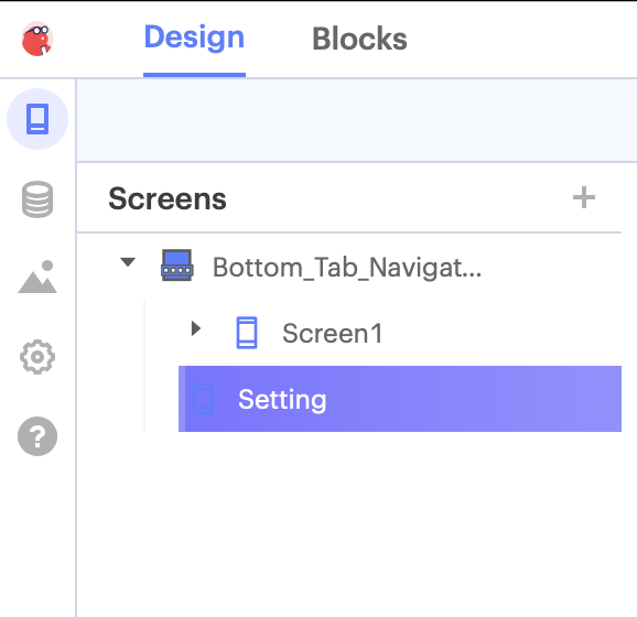
Next, drag our “Screen1” (which is the first screen that we created) under the Tab Navigators so it looks like this:
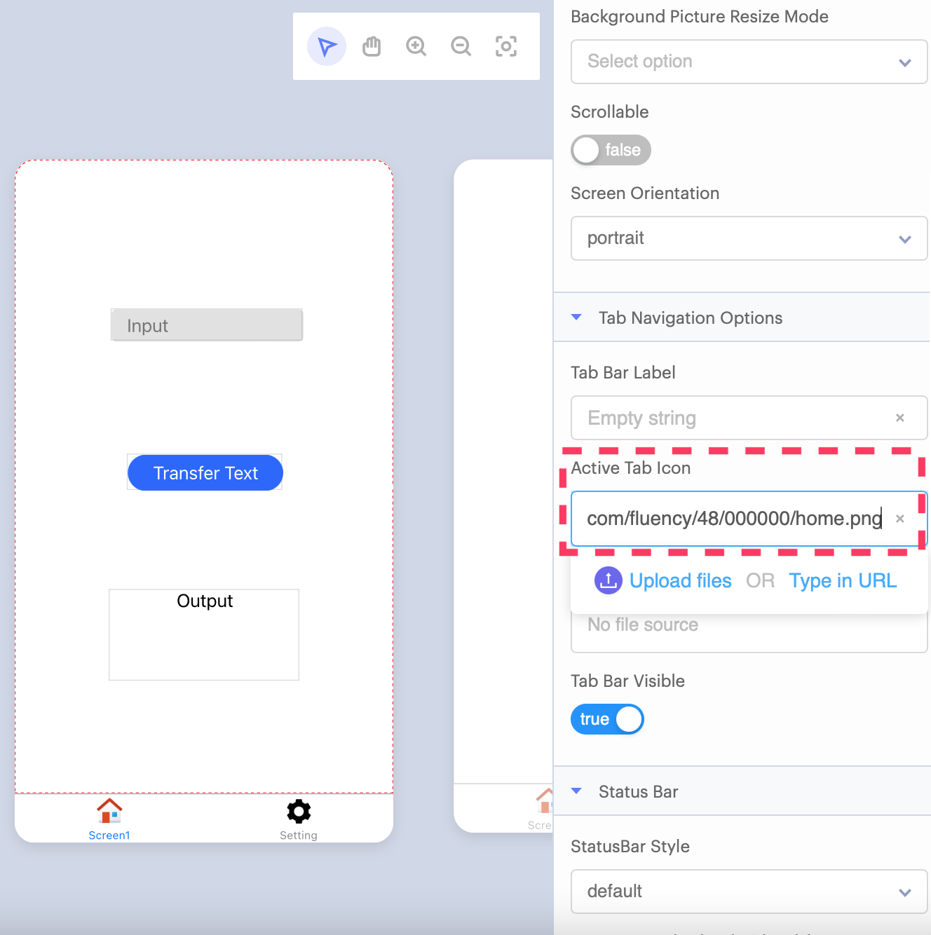
Click on “Screen1”, and you might notice that the bottom tab bar has an empty image that we don’t really want. Let’s get an icon to make it look better: copy and paste https://img.icons8.com/fluency/48/000000/home.png into the field called “Active Tab Icon”. Next, we want to rename “Screen1” to something that makes more sense. Click the Screen1 text and you can change it to Home so it matches the icon.
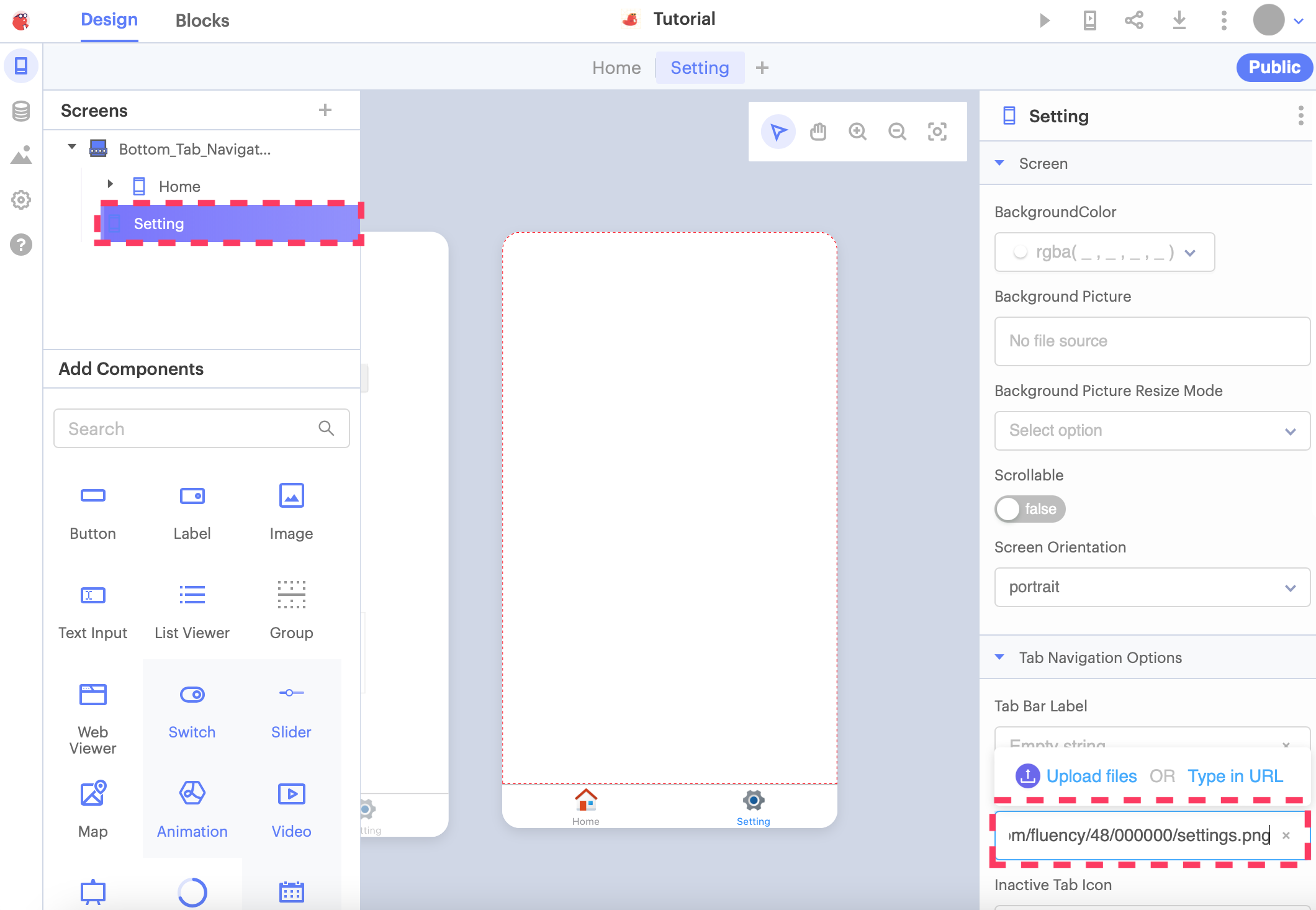
Let us give the Settings page a nicer icon too! Click on the Setting screen on the left and change the link in the “Active Tab Icon” setting to https://img.icons8.com/fluency/48/000000/settings.png.
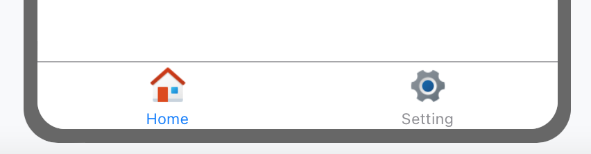
Much better looking now!
Using functions
As we have a Settings page now, we can give it some options to turn certain types of text manipulation on and off. Starting with a simple one, we can trim/remove all the spaces to the left and right side of the text we typed in: something like abcde will become abcde. There is a built-in function for this, and we can try it out.
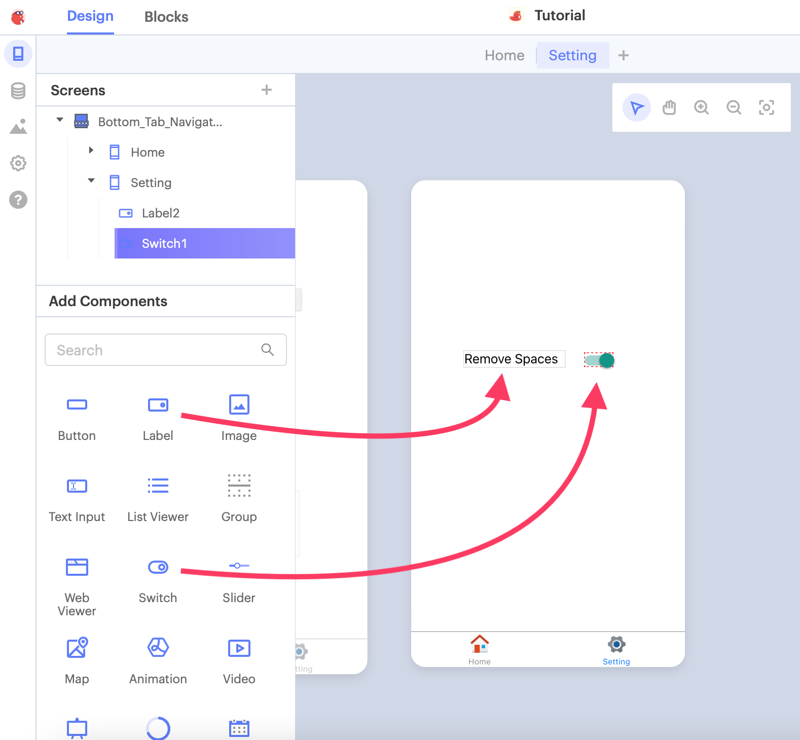
But first, we need to add a switch in Settings so that we can turn this feature on and off.
Add a Label and a Switch according to the diagram below, and set the default value of the Switch to “false”:
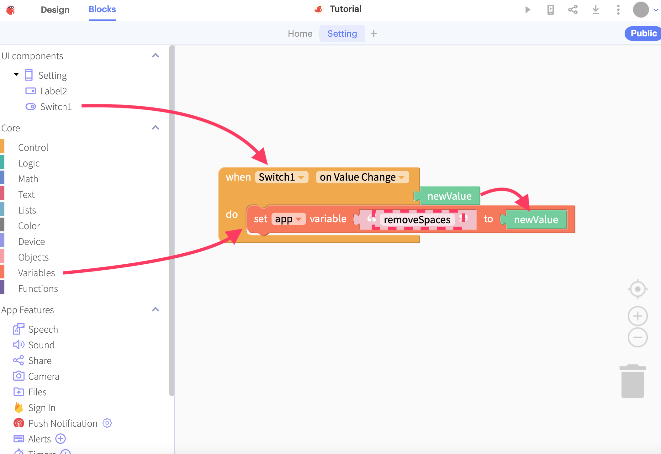
Let’s switch over to blocks to add our code…We want the value of the Switch to be stored in a variable so that it can be read by our program on the Home tab. Drag the when Switch1 on Value Change block into the editor, and set a new variable called removeSpaces to whatever the newValue of the switch is. We are now done with the Settings screen!
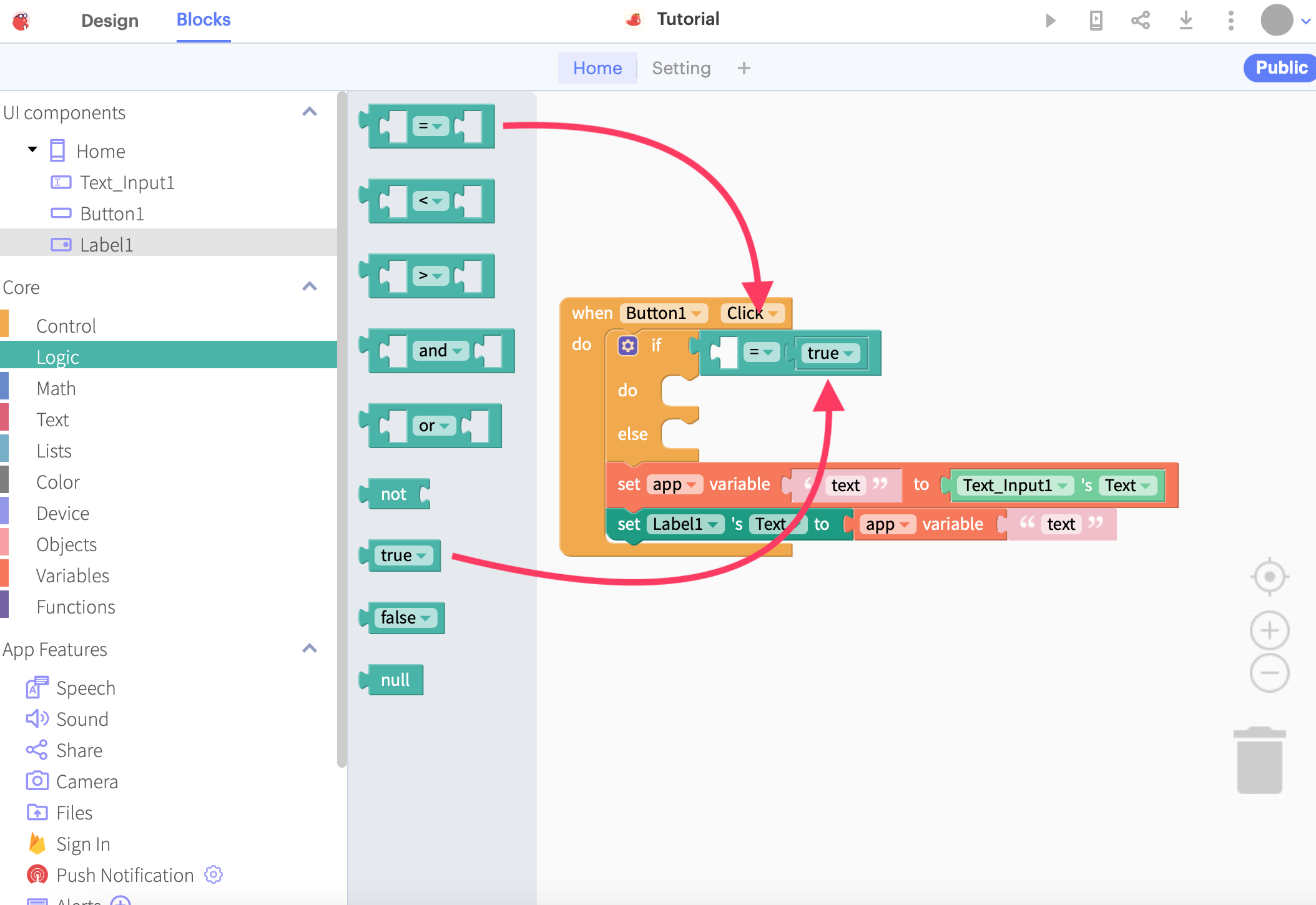
Moving back to the blocks for Home, we can add an if block to our button click event so that we check for that setting we just made previously.
After that, drag a Logic __=__ block to check if the statement is equal to true, and drag a true block to the right-hand side of the equals sign.
Finally, drag the app variable block from the Variables menu to complete the if statement. Change the variable name to removeSpaces so it matches the name on the other screen.
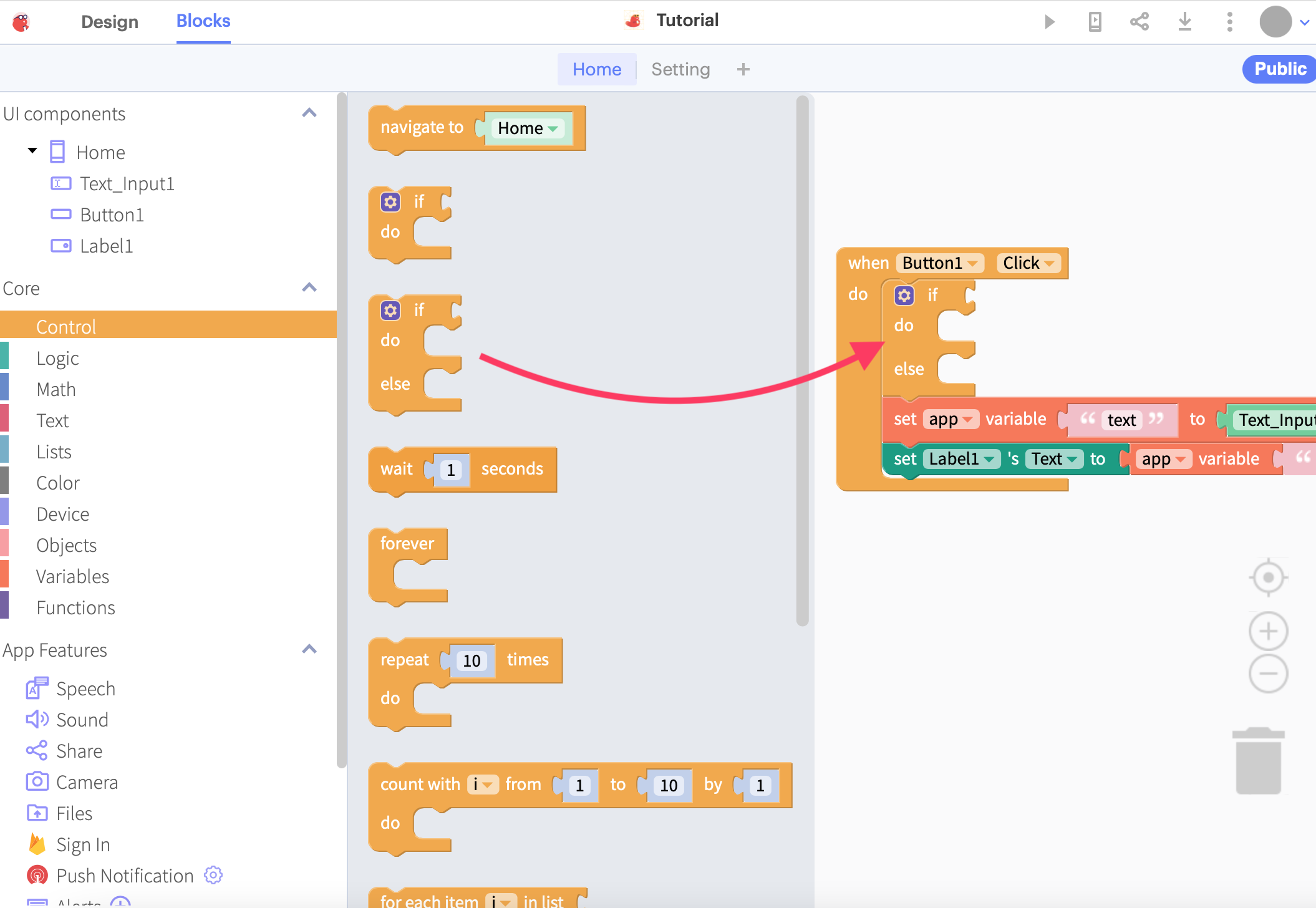
At this point, we want to reorder our program a bit so it makes more sense. Recalling that the intention of this app is to:
- Detect when the button is clicked
- Read the text from the Text Input
- (NEW) Process the text IF the switch on Settings is on
- Set the contents of the Label to the same contents of the Text Input
We have inserted a new step between the 2nd and last step, which is to process the text IF the switch is active. As such, the program needs to be organised in the same way and here’s how:
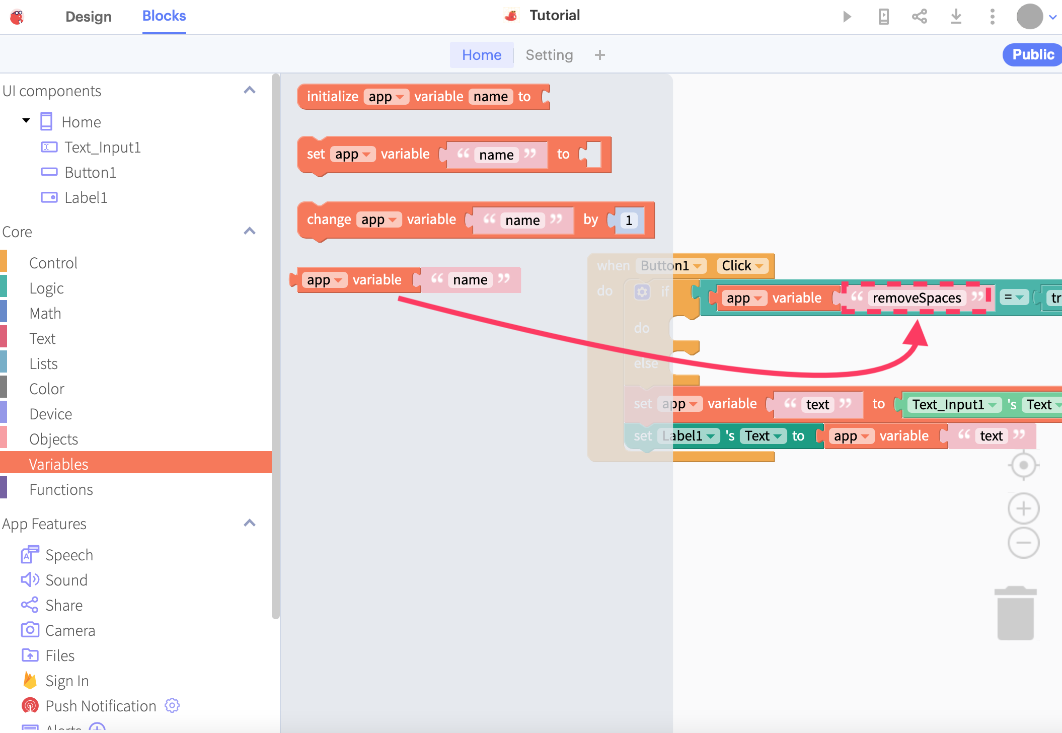
With these changes done, we can drop in the last piece of code that actually performs the change. In programming, we can actually assign a variable back to itself. For example, if you have a statement in Arduino that says i = i+1;, it is perfectly valid as it adds 1 to i. (Note that this is not valid in maths)
In our case, we can assign the variable called “text” back to itself after we have finished removing the spaces before and after it. We would need to drag 3 types of blocks into the editor: “set app variable” which allows you to set a variable, “app variable” which gets the contents of a variable, and “trim spaces from both sides” from the Text menu to actually trim the spaces.
Once complete, your code should look something like this:
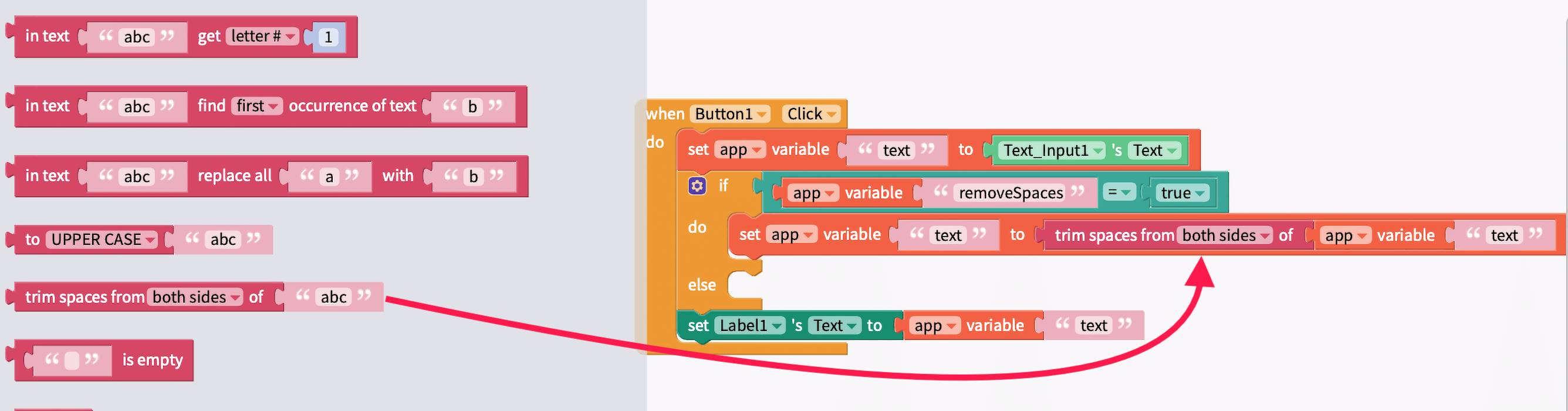
Leave the “else” block empty since we don’t need to change the text when the switch is off.
Finishing touches
We are almost entirely done with our app! For the finishing touches, let’s change the Border Width to 1 pixel, and Text Alignment to “Left” so that we can easily see the differences in the text output.

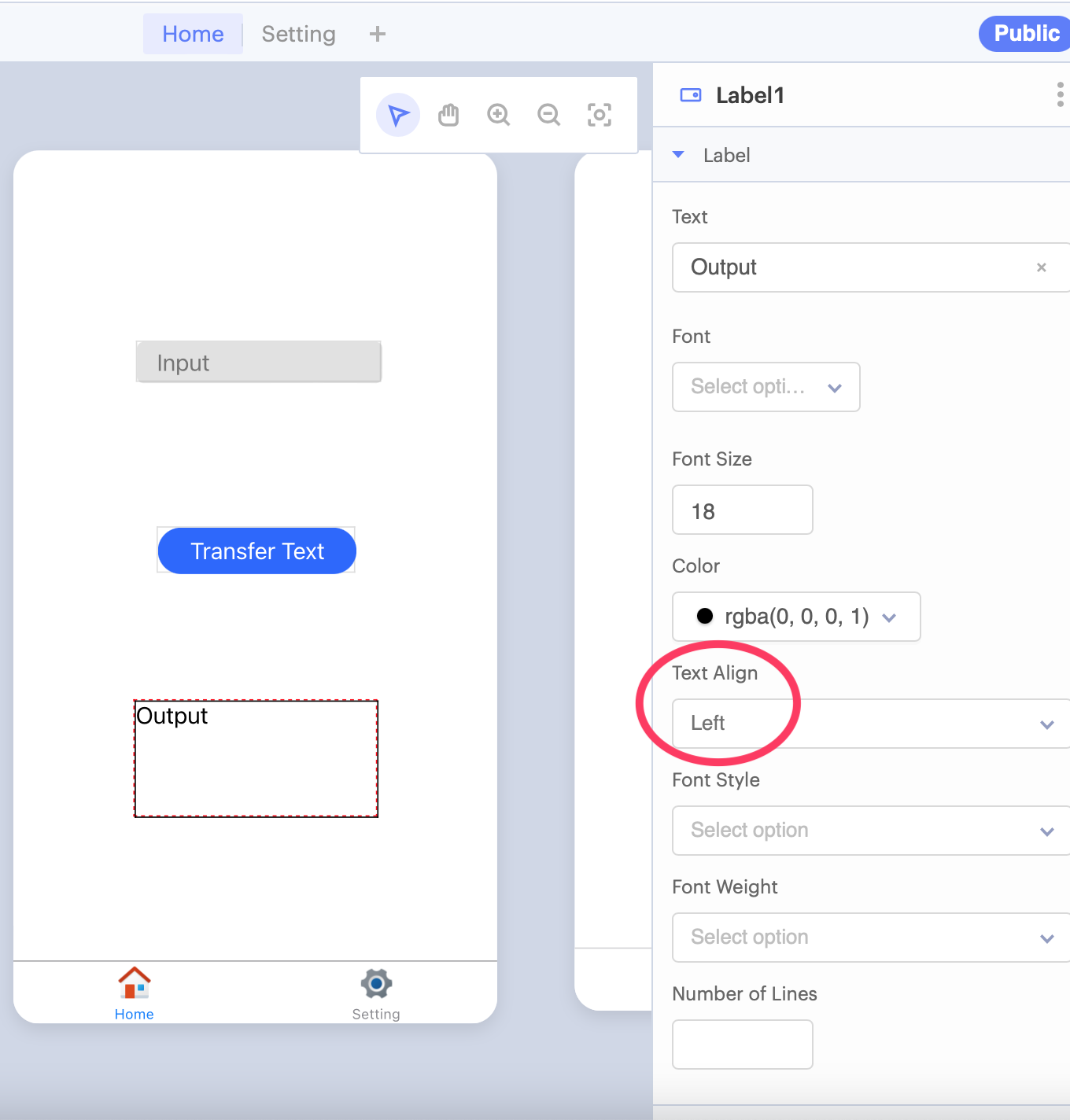
With that done, your app should look a little bit like this…
Resources and Going Further
If you want some beautiful icons to use in your apps, projects and presentations, this is the icon suite that was used in this tutorial: Icons8 Fluency Icons